jon_b

Forum Elite
Joined
Aug 28, 2009
Messages
7,557
Location
EU
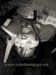
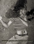
I recently attended a PS training workshop which covered 'gradient mapping'. I like B/W images - but discovered this powerful way to map a full colour palette to a more limited range of colours to produce images that appear B/W but which have been mapped to several colours. You can end up with images which are subtle and rich - also useful in improving or restoring older damaged photos.

I have been practising on some pics recently added to my collection - and posted now for the interest of our CDG members.

 
posted now for the interest of our CDG members.

Those are so good jon_b; thanks for your "treatments". I find the guy with the deathstare quite hauntingly lovely.

The guy next to him (in your selection) who has been stabbed in the chest and sat in a chair, looks as if he might have had his eyes put out first -chilling imagining his agony of body and mind.

The hanger is a favourite of mine, but he is so much more arousing in b/w. But I do also love the pic of him dancing on the rope with his "knees to the chest efforts" elsewhere on CDG

hanged 17ze.jpg
 
Last edited:
You do such good work, Jon! Black-and-white will never go out of style. Color is great, but there are many instances where a black-and-white rendering produces superior results. If you haven't already, perhaps you should find a market for your PS skills, and get paid for your expertise.

The full-face portrait images in this set are particularly artistic.
 
Back
Top