Do you like the new black & red design?


  • Total voters
    46

Meatpie

OWNER/ADMIN
Staff member
Administrator
Joined
Oct 7, 2008
Messages
59,953
Location
Bulgaria
Hi all,

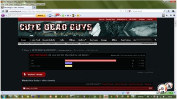
CDG's beautiful black design broke after Tuesday's software upgrade and no matter how hard we tried we couldn't fix it and it passed away.

It's goodbye to black & purple skin forever.:sad1:

We have now introduced a new black & red theme, hope you like it.

Feedback is welcome.

We have also introduced a brand new video sharing section, it's still in beta testing.

Share, rate & comment on your favoirite videos without having to click youtube links in every post!

Please report any bugs & glitched with the new skin and video sharing.

Best,

Cute Dead Guys forum staff
 
Friad I don't like the new design at all - the frames are in a really bright red, lot of the text is a really dim grey that I can hardly read - in fact I'm not sure I'll finiish catching up, it;s giving me a headache already.
Sorry Meatpie - itss end of a bad day here - but this just is'n't easy to read at all for me.
 
Thank you for your feedback DD, really sorry to hear you are having a bad day.

What kind of colour theme do you think will be easy to read, suggestions welcome. We will work to introduce more skins so that users can switch between dark and bright skins.
 
I like red better than purple, but maybe if the red were a little muted, less intense. I still like the design though, good job Meat.
 
Thank you for your feeback and for voting in our poll. We take all opinions into account when we plan for future upgrades.
 
Personally I was impressed when I came on tonight - the red really makes things show up. White on black or white on red is good - I don't see the grey DD was referring to but grey would fade into the red or black.
 
Meatpie, I like it, and I'm glad that the gray box in the posting window has white text now instead of black as it was difficult to read like deaddirty mentioned.
 
Site Design

I like new design. I haven't had any problems reading the text. I shows up very well IMO. When posts are made in dark colors then I find that hard to read. :yes:
 
I agree that a lot of the text is a really dim grey and that it is difficult to read...... perhaps my eyesight is failing from looking at all the CDGs!!
 
Many positive points in the new skin: the rep star and other controls are much better visible, and I always preferred the red skin option to the black, which was a bit dull to me. I have no problem reading any texts (brighter screen?).

Of all the banner variations we saw these past weeks I like this one best by far (casket dude on the right, and bright feet sticking out from behind the site name).

I also LOVE the new tabs in the Profile section (yeah I know they're skin-independent): great improvement.

A negative point: the site is now narrow on my screen (empty regions on both sides of the screen). If I want to see the whole menu (Home ... Contact us), which otherwise disappears partly behind the search box, I have to set my zoom so the text becomes too small to read comfortably.
 
I am amazed to see so much feedback less than 24 hours after we switched to the new skin. We read all comments and on occasion we may contact individual members and help them reslove skin issues.

PiercedChest, please post a sceenshot of your top menu, if if is behind the search box we may have to widen the forum.

All feedback & suggestions are welcome.

Poll results are so far positive.

Some users complained that text is too dim or dark while others say it's OK.

It all depends on your sceen settings, good contrast especially.
 
PiercedChest, please post a sceenshot of your top menu, if if is behind the search box we may have to widen the forum.

Here it is:


For my computer at least, a widening would be appreciated.

Thanks for all your efforts to keep this great site online and up-to-date!
 
Nice screenshot, thanks.

I guess we will have to remove some links from the menu, it's too crowded.

Please follow this thread for further updates.

BTW why do you have so many icons in your taskbar?
 
OK, we have removed the "Help" link, no good use anyway.

Can you see all the links now Pierced, all the way to contact us, which is the last link?

If you still have a problem seeing all the links please take another screenshot and post it.

Thank you for your time and help.
 
I love the new design and colors,
improved smoother posting ability!

And HEY!
The airing ripe manly foot in the banner
are just way too
randy dandy
primal PRIME-TIME primo fine!!

:winner::dancing::hat::rocks4::Rock2:
 
OK, we have removed the "Help" link, no good use anyway.
Can you see all the links now Pierced, all the way to contact us, which is the last link?

Yes, I can see all menu items now.
I still have those empty spaces at both sides though (no serious problem, but didn't have that earlier).
The difference between the 'live feed' and 'recent activity' menu options is not clear to me, so if you think about sobering that up ...
 
The recent activity tab will only show you threads with new posts. Nothing else.

The forum live feed on the other hand is about real-time updates, much like twitter - the moment someone makes a post or updates their status it will turn up in the live feed.

The live feed also shows other forum activity like changed avatars, group posts, album updates etc.

Hope this helps.
 
Yes, I like the new black and red design. At first, I thought, I touched something, to change the color. My fingers are always touching the wrong keys and messing things up. But now, I notice this message, so I fell good it was't me. Anyway, great job, I love this site, I am in it almost every day. It's great to know there are many other guys out there, who enjoy the same fantasies I have. Before finding this site I thought, I was alone in the world. Thanks for this site.
 
Back
Top